A race bib looks like the simplest print job at an event, a number on a rectangle, until you try to lay one out and discover how many jobs that rectangle has to do at once. It has to be readable from thirty feet by a finish-line camera, survive rain and safety pins for a few hours, carry sponsor logos that paid for the race, hold a timing tag on the back, and give medical staff a runner’s emergency contact if something goes wrong. A good template is what keeps those demands from colliding. Here is how the pieces fit, from the number outward.
Start with the size, then the number
Bib dimensions vary by event, but most land in a familiar band. A common all-purpose size sits around 6 by 9 inches, small events and kids’ races drop closer to 5 by 7, and slim competitor-number strips run as narrow as 8 by 3.5 inches. Pick the size first because everything else is a proportion of it. The race number is the single most important element and should dominate the layout; on that 8 by 3.5 inch strip the numerals stand about 2.5 inches tall, and larger marathon bibs push the digits taller still so a camera can read them across a crowded chute. As a working rule, make the number as large as the bib allows after margins, set it in a heavy, condensed typeface, and keep it in solid black on a light field for the highest contrast. Everything that is not the number is secondary and should look it.
The zones on the front
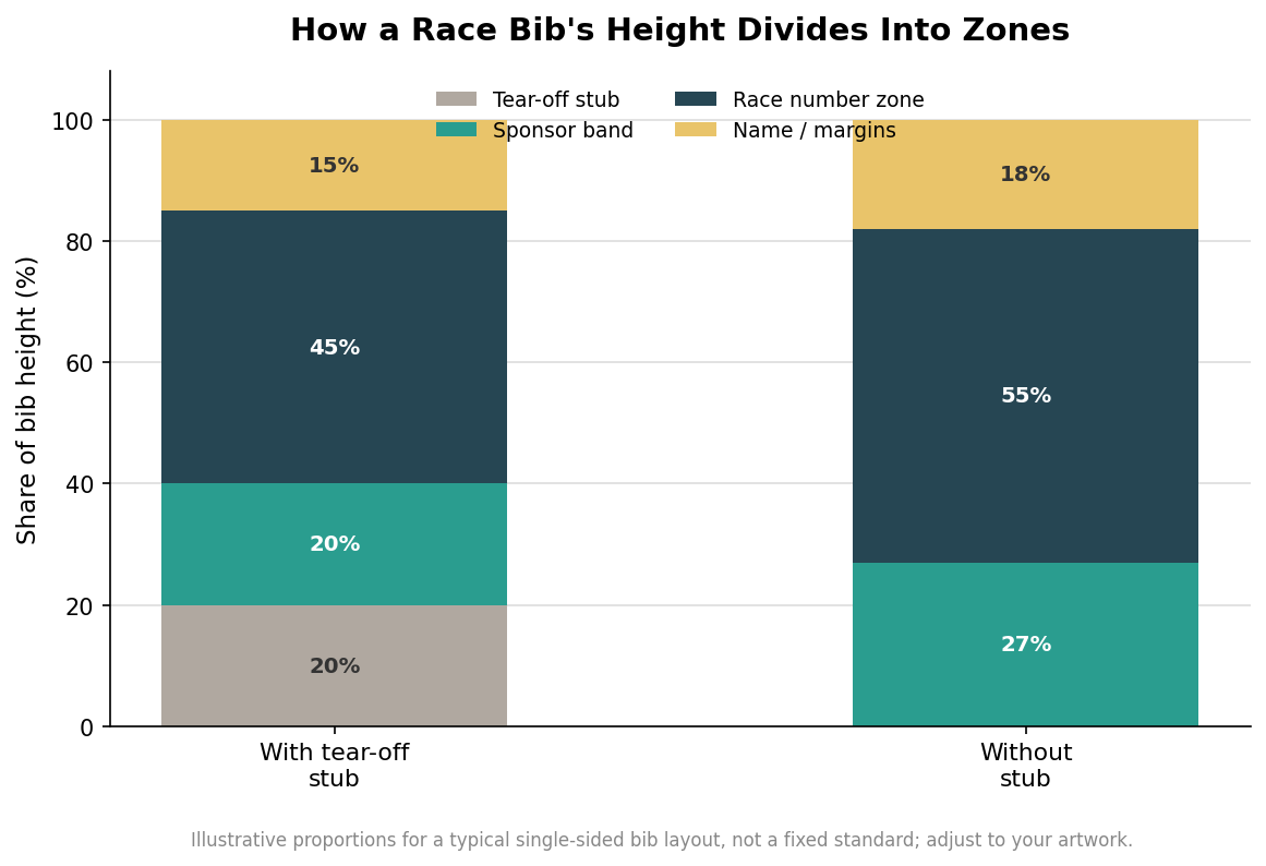
Think of the front as stacked bands rather than a blank canvas. The number zone takes the center and the majority of the height. A thin name or message line can sit above it for personalized bibs, which lift finish-line energy when a spectator can shout a runner’s name. The sponsor band belongs at the bottom, where logos stay visible without competing with the number, and it is worth reserving that strip early because sponsor artwork always arrives late and in the wrong proportions. If the race uses barcodes or QR codes for check-in or results, they need a quiet corner with clear space around them so a scanner is not fighting a logo. Larger races add one more layer to this band structure: a color block or a printed letter that marks a runner’s start wave or corral, which lets volunteers sort a field of thousands at a glance. Keep that marker bold and near the top or a corner where a marshal can see it without asking the runner to turn around. Resist the urge to fill every gap; white space is what makes the number pop.
The stub and the corners
Two functional details decide whether a bib works on the ground. The first is the tear-off stub, a perforated strip usually at the bottom that staff pull for bag check, results reconciliation, or a post-race meal, and it needs its own space with the runner’s number repeated on it so a detached stub is still identifiable. The second is the corners. Bibs are pinned through all four, so keep the number and any vital text inside a safe margin away from the corners and edges, because a pin through a digit or a logo looks careless and can tear. Leaving a clear border of roughly a third to half an inch around the live area also gives the material something to give when it flexes, which matters more on paper than on Tyvek.
The back is not blank space
The reverse of the bib does real work. Most events print an emergency contact and basic medical field on the back for runners to fill in, a small safety feature that medical teams genuinely use. The back is also where the timing tag lives on chip-timed races. Disposable UHF RFID tags are fixed to the back of the bib, mounted on a thin protective foam layer that holds the antenna off the runner’s body and keeps it dry, and they can be applied horizontally or vertically depending on the tag and the timing system. If your race is chip-timed, ask the timer for their tag footprint and keep that area of the back free of heavy ink and folds, because a crease across the antenna is a lost read at the mat. Design the back at the same time as the front, not as an afterthought once the artwork is approved.
Material, cost, and a clean export
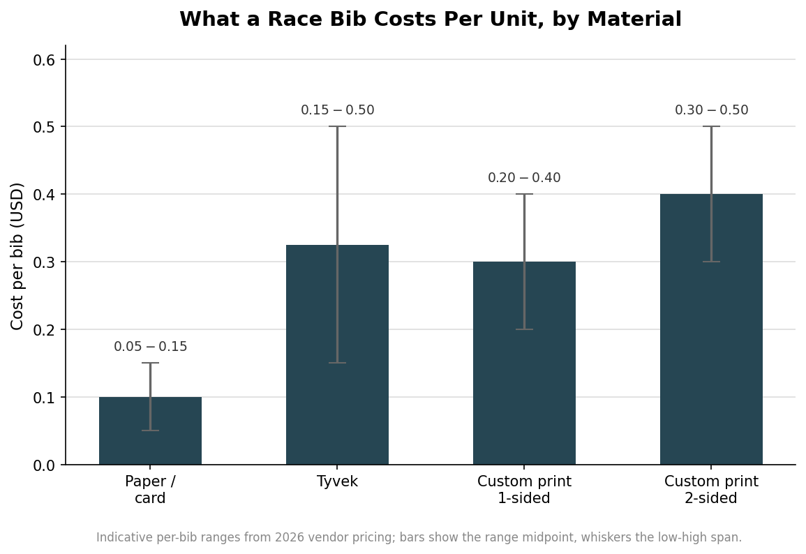
Material sets both durability and budget, and the spread is wide for such a small item. Plain paper or card bibs run roughly 5 to 15 cents each and suit dry, short, low-stakes events. Tyvek, the tear- and water-resistant synthetic that most serious races use, lands around 15 to 50 cents per bib depending on size and print. Full-color custom printing tends to sit near 20 to 40 cents for a single-sided bib, with roughly another dime per bib to print the back as well, which is money well spent once you are putting emergency fields and a timing tag back there. When you export the template, build it at the final size with a small bleed, keep the number and critical text inside a safe margin, and supply sponsor logos as vector art so they stay crisp at any scale. Lock the size, the number, and the back layout early, and the race bib stops being a last-minute scramble and becomes the reliable, readable rectangle the whole event depends on.
Leave a Reply